
Friday, March 19, 2010
Thursday, March 11, 2010
Sidenote Post 3
This is a quick painting by Barontieri, a Massive Black artist – the painting is sped up and done what I’m pretty sure is Open Canvas, a raster painting program – I love seeing simply paintings done quick, especially from these dudes whose knowledge of light is way beyond mind – definitely worth a minute or so of your time
Assignment 20
3/11 Evaluate Design Comm. Talk about both successes and ways to improve the course.
This DesComm class was extremely beneficial to me personally this quarter as I was able to tailor the projects to benefit my career goals and work up my mechanical and storytelling skills.
Being able to be judged based on the career path that I am following helped me much more than having to do work that was exclusively for class and for a grade.
While doing the portfolio portion of the course, I think it would be beneficial to find portfolios from designers and artists that are not from our school, and potentially not from our major. This I think could expand our visual palette from the style of portfolios that we are most used to seeing, and strengthen our skill in story presentation.
The course was well-paced, and crits were always the right length and purposeful. Breaking down portions of some of the later projects into smaller group critiques was also helpful and kept the pace of those projects moving.
All in all, the course has been extremely helpful to me.
Assignment 19
3/9 Evaluate Your Work This Quarter and list your goals for the next quarter
I was in generally fairly happy with the work I was able to churn out this quarter. I was allowed to take virtually all of the projects in my own direction, which helped very much in only my design theory, but also in pure mechanical skill practice.
I’m still not fast enough at the work I want to create. I often have to do steps that deserve much more time and attention too fast in order to rush out a final concept or concept set. This is something I want to continue working on over this next co-op (both in my job and free time), and in the next school quarter.
I need to create quality “workup” concept art that I am as equally satisfied with as the final concept that I end up completing.
For next quarter I also need to stay in keeping with this quarter’s policy of wasting as little time as possible sketching products and product designs and working on my concept art skills.


Assignment 17
3/2 – Evaluate the use of blogging as a communication tool for design.
I think blogs work much better as a tool for displaying sketches and process shots than for presenting your thoughts and ideas, merely because the formatting is so basic. I know that’s the whole point (the ease of posting/commenting and basic formatting), but being unable to present text data in any way other than in an endless stream of text can be very limiting. I find myself even on the artist’s blogs whose work I am very interested in still scrolling through any text and looking straight to imagery, unless the images posted are a process book or tutorial of some kind.
I think that designs and art are still best communicated online through websites, where there is room for personalization and better structured for presenting information.
Assignment 16
iPod Shuffle
I’ve always had around 500 gigs of music, so there really hasn’t ever been an iPod that can hold it all, and that would be stupid anyway. Enter my iPod shuffle, purchased late in my freshman year of college and still going strong. I’ve done everything but eat it and it still works great, and I’m thinking about eating it and then using it later just to say I did.
I’ve driven over it, dropped it a few stories, washed it, and even left it outside in the elements accidentally several times. Also, the thing doesn’t have an LCD, so it uses virtually no power. I forget that I even have to charge it because I have to do so rarely, even with frequent use.

The Nintendo 64 Controller.
Yeah, yeah I know, it looks like a wad of bananas with buttons. But, despite its goofy appearance, the way this controller could be utilized by multiple age groups and for multiple types of gameplay comfortably makes it my favorite. The controller can be used by toddlers because it sits upright on a flat surface or floor, and the buttons can be utilized without gripping the entire controller. It’s one of the more functional in multiple types of gameplay settings than most that I’ve used, and additionally is a little less frightening to less frequent players. I always thought it had a more natural feel than most systems of the period and definitely trumps a few of the systems’ standard controllers that followed it.

My straight razor
I started using one occasionally to shave, because there’s nothing cooler than shaving with a razor that can cut your head off. After using it for a bit, I realized that while there is definitely a learning curve in learning to use it, the tool itself is very simple, well-balanced and easy to hold. The learning curve is entirely technique and not really how to interact with the tool itself.
The carbon steel blade dulls very easily but this is due to the extreme malleability of the metal, so it’s easy to sharpen again, and will be able to be
resharpened to its original edge many, many more times than stainless steel blades.This is one of my favorite designs/products because it was around before things we’re designed to intentionally fail and be replaced. If I take care of my razor properly, it’s likely I could use it my whole life and not replace it. Even Volvos don’t last that long.

Assignment 15
2/23
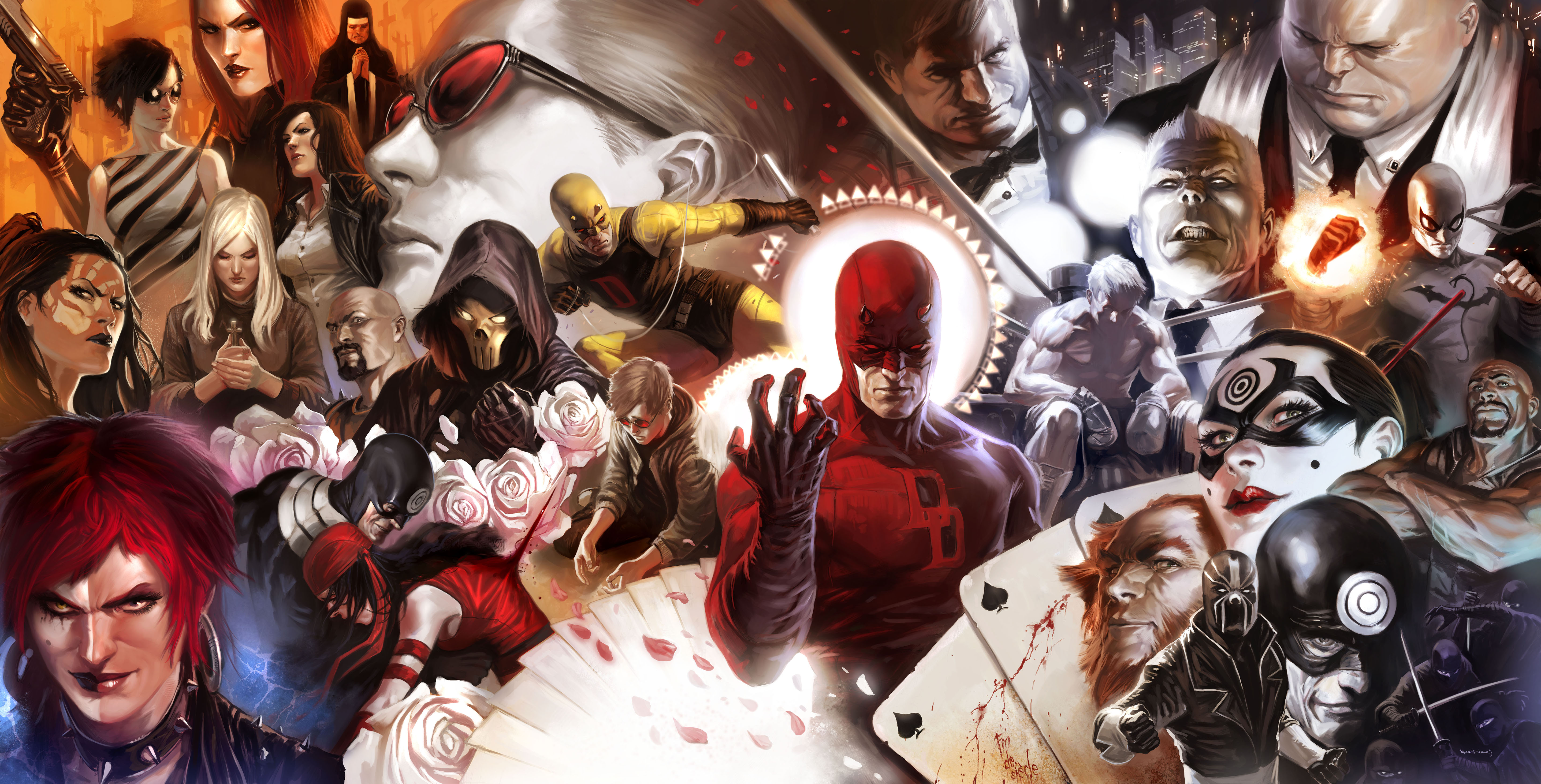
This is a link to SideBar, a comics website that has a link at the bottom to an audio interview with Marko Djurdjevic, one of the founders of Massive Black and serious contender for one of the most talented artists alive. Completely worth your time and it’ll inspire anybody – the second link is a different text interview –
Audio Download
Text Interview
Assignment 14
2/18 Review your goals from the beginning of the quarter and evaluate your progress
At this point in the quarter things have been going good, I admittedly am a whole lot less jazzed about my Industrial Design project than I was at the beginning of the quarter, but that really isn’t anything new.
The work I’ve been able to do for my Independent Study and DesComm is really getting me the practice I need. It’s much nicer not having to break my concept art stride to sketch products that I’m not really interested in, and sketching characters is keeping me sane.
Assignment 13
2/16
Write about your individual strengths as a designer and how you focus on them
As a designer I am much better at sketching than 3D modeling and vector work. I prefer to put pencil to paper/stylus to cintiq than use a mouse in any way. I’m doing my best to enhance not only my visual palette but my mechanical skill and speed. When it comes to the type of art and design that I want to make a career of (toys/concept art), the theory that drives the design is just as important as the mechanical skill that it takes to accurately communicate it. I’m doing my best to spend as much time as possible developing this skillsets and tailoring my projects to them.


Wednesday, March 10, 2010
Assignment 11
2/9
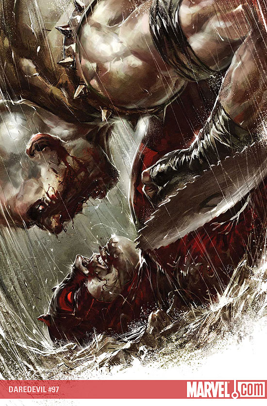
Write your definition for good design (concept art), showing three examples
A good piece of concept art in my opinion communicates an emotion and story, whether it’s a static posed character, an environment or a weapon. The artwork has to have a definite “feel” that isn’t up to many variations of interpretation. While some of the artwork may have its roots in abstracted form, the point of concept art is that it is meant to convey very specifically action, character emotion, story direction, whatever.
Its meaning or purpose that people interpret from just one look is meant to be similar to the next guy’s interpretation.
These are some of the best examples by current Massive Black, Inc. artists.
http://mandrykart.files.wordpress.com/2009/11/at_the_end_of_the_world.jpg
http://www.manwithoutfear.com/interviews/DD097.jpg
http://www.casbot.com.au/wp-content/uploads/2008/12/03_10_2008_0290509001223042162_jason_chan.jpg
Sidenote Post 2
This is a quick overview of El Coro’s (a Massive Black artists) process of making weaponry – it definitely has some application to product design because he incorporates 3D modeling to create multiple views as well as the extremely important “reverse” view.
Sidenote Post 1
Everyone look at Ryan Church’s site. His stuff is amazing, and there are links to his tutorial DVDs and gallery. I know no one has money laying around, but if you’re going to invest in anything art related, his Intro to Painter and Rendering Matte Vehicles DVDs are completely worth the time and money.
http://www.ryanchurch.com/index.htm
This is also some quick composition some dude has made of some keyframe art of Ryan Church back to back with the final frames of film.
http://www.ryanchurch.com/index.htm
This is also some quick composition some dude has made of some keyframe art of Ryan Church back to back with the final frames of film.
Assignment 10
2/4
Find two inspiring storyboard examples and compare/contrast the work
http://www.ghull.com/art/revolutions/art_mtxrev_thumbs_01.php
The storyboarding of George Hull (who was one of the primary concept and storyboard artists on the Matrix sequels) is very loose and painterly, but also very literal. There is extreme depth in all of his boards and keyframes and his color palette communicates an awesome sense of atmosphere. Even though every volume is not hardened into specific forms, there are elements with detail and the frames are easily linked. Personally I find this very hard to do while still painting loosely, especially in a storytelling scenario where what is important and what isn’t has to be established.
The frames displayed appear to be very complete, and the final film follows these storyboards shot for shot, making me believe that Hull was chosen for the work because of his detailed precision and accurate shot composition.
http://www.starwars.com/episode-i/bts/production/f19991222/index.html
Much of the storyboard art for Star Wars: Episode 1 falls into two categories: keyframes (highly-detailed precise shots) and then everything else in between. The process described by the artists who worked on Episode 1 essentially details that much of the artwork was done before the script and even locations and characters were totally finalized. It’s mentioned that all of the art staff were had to be capable of drawing anything because of the high volume of necessary shots between keyframes.
This art (displayed in the few pages of the article) also is extremely loose, and in some cases even looser than George Hull’s work. The sense of atmosphere created by the ILM concept artists comes from the shot composition, as most of the frames do not involve color. However, despite the lack of color and a slight disparity in how tight and detailed George Hull’s work is on the Matrix film storyboards compared to the Episode 1 ones, both storyboards have heavy depth, with a sense of scale and atmospheric volume easily communicated through their use of tone.
This is something I admire heavily because of how fast these artists must work, and to be able to communicate the right amount of form and put in depth quickly is impressive.


Assignment 8
1/28
These are some of the best examples of Photoshop rendering/painting I have ever seen. All three are by different artists (Marko Djurdjevic, Daryl Mandryk, and Cryptcrawler, respectively) and it should be noted that none use 3D reference in their art.
http://texcap.files.wordpress.com/2009/03/daredevil500_coverspread_final1_low.jpg
http://www.conceptart.org/artimg/mandryk/full/mandryk-05.jpg
http://cghub.com/images/view/13275/
Sorry for the image links, but I feel weird putting their art on my blog.


Subscribe to:
Comments (Atom)