2/9
Write your definition for good design (concept art), showing three examples
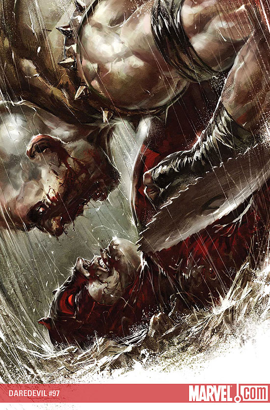
A good piece of concept art in my opinion communicates an emotion and story, whether it’s a static posed character, an environment or a weapon. The artwork has to have a definite “feel” that isn’t up to many variations of interpretation. While some of the artwork may have its roots in abstracted form, the point of concept art is that it is meant to convey very specifically action, character emotion, story direction, whatever.
Its meaning or purpose that people interpret from just one look is meant to be similar to the next guy’s interpretation.
These are some of the best examples by current Massive Black, Inc. artists.
http://mandrykart.files.wordpress.com/2009/11/at_the_end_of_the_world.jpg
http://www.manwithoutfear.com/interviews/DD097.jpg
http://www.casbot.com.au/wp-content/uploads/2008/12/03_10_2008_0290509001223042162_jason_chan.jpg
Wednesday, March 10, 2010

Sidenote Post 2
This is a quick overview of El Coro’s (a Massive Black artists) process of making weaponry – it definitely has some application to product design because he incorporates 3D modeling to create multiple views as well as the extremely important “reverse” view.
Sidenote Post 1
Everyone look at Ryan Church’s site. His stuff is amazing, and there are links to his tutorial DVDs and gallery. I know no one has money laying around, but if you’re going to invest in anything art related, his Intro to Painter and Rendering Matte Vehicles DVDs are completely worth the time and money.
http://www.ryanchurch.com/index.htm
This is also some quick composition some dude has made of some keyframe art of Ryan Church back to back with the final frames of film.
http://www.ryanchurch.com/index.htm
This is also some quick composition some dude has made of some keyframe art of Ryan Church back to back with the final frames of film.
Assignment 10
2/4
Find two inspiring storyboard examples and compare/contrast the work
http://www.ghull.com/art/revolutions/art_mtxrev_thumbs_01.php
The storyboarding of George Hull (who was one of the primary concept and storyboard artists on the Matrix sequels) is very loose and painterly, but also very literal. There is extreme depth in all of his boards and keyframes and his color palette communicates an awesome sense of atmosphere. Even though every volume is not hardened into specific forms, there are elements with detail and the frames are easily linked. Personally I find this very hard to do while still painting loosely, especially in a storytelling scenario where what is important and what isn’t has to be established.
The frames displayed appear to be very complete, and the final film follows these storyboards shot for shot, making me believe that Hull was chosen for the work because of his detailed precision and accurate shot composition.
http://www.starwars.com/episode-i/bts/production/f19991222/index.html
Much of the storyboard art for Star Wars: Episode 1 falls into two categories: keyframes (highly-detailed precise shots) and then everything else in between. The process described by the artists who worked on Episode 1 essentially details that much of the artwork was done before the script and even locations and characters were totally finalized. It’s mentioned that all of the art staff were had to be capable of drawing anything because of the high volume of necessary shots between keyframes.
This art (displayed in the few pages of the article) also is extremely loose, and in some cases even looser than George Hull’s work. The sense of atmosphere created by the ILM concept artists comes from the shot composition, as most of the frames do not involve color. However, despite the lack of color and a slight disparity in how tight and detailed George Hull’s work is on the Matrix film storyboards compared to the Episode 1 ones, both storyboards have heavy depth, with a sense of scale and atmospheric volume easily communicated through their use of tone.
This is something I admire heavily because of how fast these artists must work, and to be able to communicate the right amount of form and put in depth quickly is impressive.
Find two inspiring storyboard examples and compare/contrast the work
http://www.ghull.com/art/revolutions/art_mtxrev_thumbs_01.php
The storyboarding of George Hull (who was one of the primary concept and storyboard artists on the Matrix sequels) is very loose and painterly, but also very literal. There is extreme depth in all of his boards and keyframes and his color palette communicates an awesome sense of atmosphere. Even though every volume is not hardened into specific forms, there are elements with detail and the frames are easily linked. Personally I find this very hard to do while still painting loosely, especially in a storytelling scenario where what is important and what isn’t has to be established.
The frames displayed appear to be very complete, and the final film follows these storyboards shot for shot, making me believe that Hull was chosen for the work because of his detailed precision and accurate shot composition.
http://www.starwars.com/episode-i/bts/production/f19991222/index.html
Much of the storyboard art for Star Wars: Episode 1 falls into two categories: keyframes (highly-detailed precise shots) and then everything else in between. The process described by the artists who worked on Episode 1 essentially details that much of the artwork was done before the script and even locations and characters were totally finalized. It’s mentioned that all of the art staff were had to be capable of drawing anything because of the high volume of necessary shots between keyframes.
This art (displayed in the few pages of the article) also is extremely loose, and in some cases even looser than George Hull’s work. The sense of atmosphere created by the ILM concept artists comes from the shot composition, as most of the frames do not involve color. However, despite the lack of color and a slight disparity in how tight and detailed George Hull’s work is on the Matrix film storyboards compared to the Episode 1 ones, both storyboards have heavy depth, with a sense of scale and atmospheric volume easily communicated through their use of tone.
This is something I admire heavily because of how fast these artists must work, and to be able to communicate the right amount of form and put in depth quickly is impressive.


Assignment 8
1/28
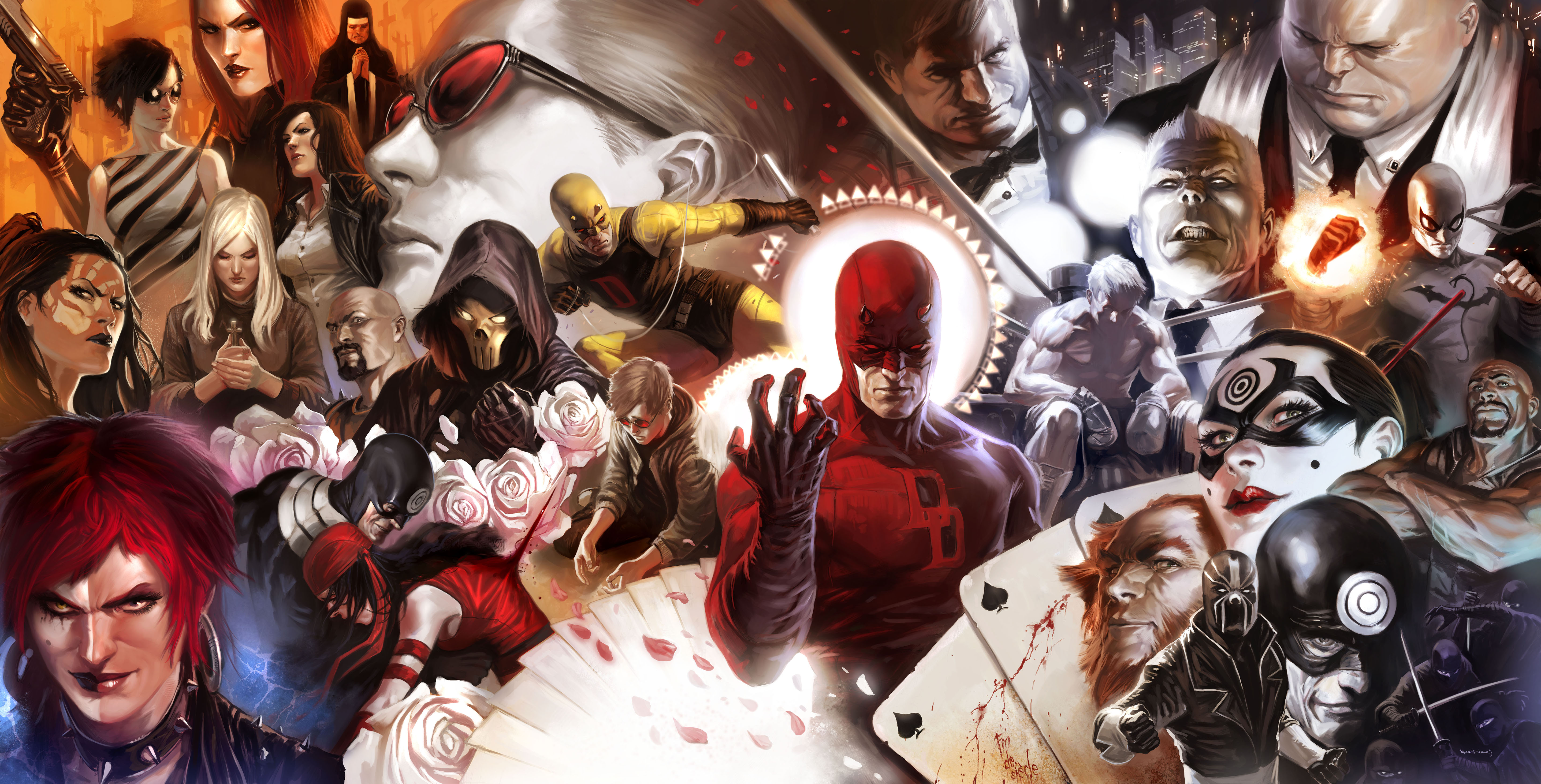
These are some of the best examples of Photoshop rendering/painting I have ever seen. All three are by different artists (Marko Djurdjevic, Daryl Mandryk, and Cryptcrawler, respectively) and it should be noted that none use 3D reference in their art.
http://texcap.files.wordpress.com/2009/03/daredevil500_coverspread_final1_low.jpg
http://www.conceptart.org/artimg/mandryk/full/mandryk-05.jpg
http://cghub.com/images/view/13275/
Sorry for the image links, but I feel weird putting their art on my blog.
These are some of the best examples of Photoshop rendering/painting I have ever seen. All three are by different artists (Marko Djurdjevic, Daryl Mandryk, and Cryptcrawler, respectively) and it should be noted that none use 3D reference in their art.
http://texcap.files.wordpress.com/2009/03/daredevil500_coverspread_final1_low.jpg
http://www.conceptart.org/artimg/mandryk/full/mandryk-05.jpg
http://cghub.com/images/view/13275/
Sorry for the image links, but I feel weird putting their art on my blog.




Subscribe to:
Posts (Atom)